

The New York Times News app is used by hundreds of thousands of people every day. An app as popular as this one often comes with powerful features and opportunities for improvement. One of my biggest challenges with reading the news is staying informed about current events without feeling overwhelmed by how upsetting the coverage can be. To address this, I explored adding a mute content feature, similar to those offered on other platforms, to give New York Times users more control over their reading experience.
Goal
Implementing a muted content feature in the New York Times News app could improve the reading experience by letting users filter out triggering, repetitive, or spoiler-related content. This would allow readers to take control of their news consumption, creating a more personalized and pleasant experience.


How do people engage with the news?
I spoke with avid news readers to understand their motivations for staying up to date with the news, what influences their decision to subscribe to paid news services, and the emotions they experience while reading. Additionally, I aimed to assess the potential value of a muted content feature and explore if there were alternative solutions that might better meet user needs. I conducted three interviews and received 17 responses to a survey addressing these questions.

I conducted a competitive analysis to explore how other platforms such as Facebook, Twitter, and Instagram implement muted content and word filter features. I examined how these apps allow users to mute words, how the feature is presented, and how it affects the user’s feed. This analysis guided my design decisions for the Times app, such as whether to allow muting both words and phrases, and if it should apply to photos and videos or just written content. Since the feature is widely used on these popular apps, I saw it as a valuable addition to The New York Times experience.
I created three personas to better understand the different ways people may have a negative experience with the news. One of them is Monica, a mother who lost her daughter to gun violence. For Monica, any mention of school shootings, violence, or assault weapons is deeply upsetting and traumatic. Given how frequently these topics appear in the news, she struggles to stay informed without being triggered by painful reminders of her loss.

How might I help users have a more comfortable and personalized reading experience?
I wanted to better understand what users find frustrating about the news and how a muted content feature could improve their reading experience and support their mental well-being.

Adding a new feature to a distinguished brand
This project had limited creative flexibility since I was developing a feature for a company with a strong brand identity. I used The New York Times’ typography and colors to match the existing design. I based the structure of the feature on insights from my competitive analysis. Because the goal of muted content is to enhance the user experience, I kept the flow simple. I designed the feature with just a few steps to ensure that users can easily understand how to use it, even on their first attempt.


Evaluating the feature’s usefulness
My goal was to design a feature that would enhance the usefulness of The New York Times app and promote positive user experiences, rather than simply adding functionality. To evaluate its potential impact, I conducted a usability test with 12 participants, including subscribers to The New York Times and non-subscribers. This testing helped me identify what worked well and what needed improvement in the current flow.

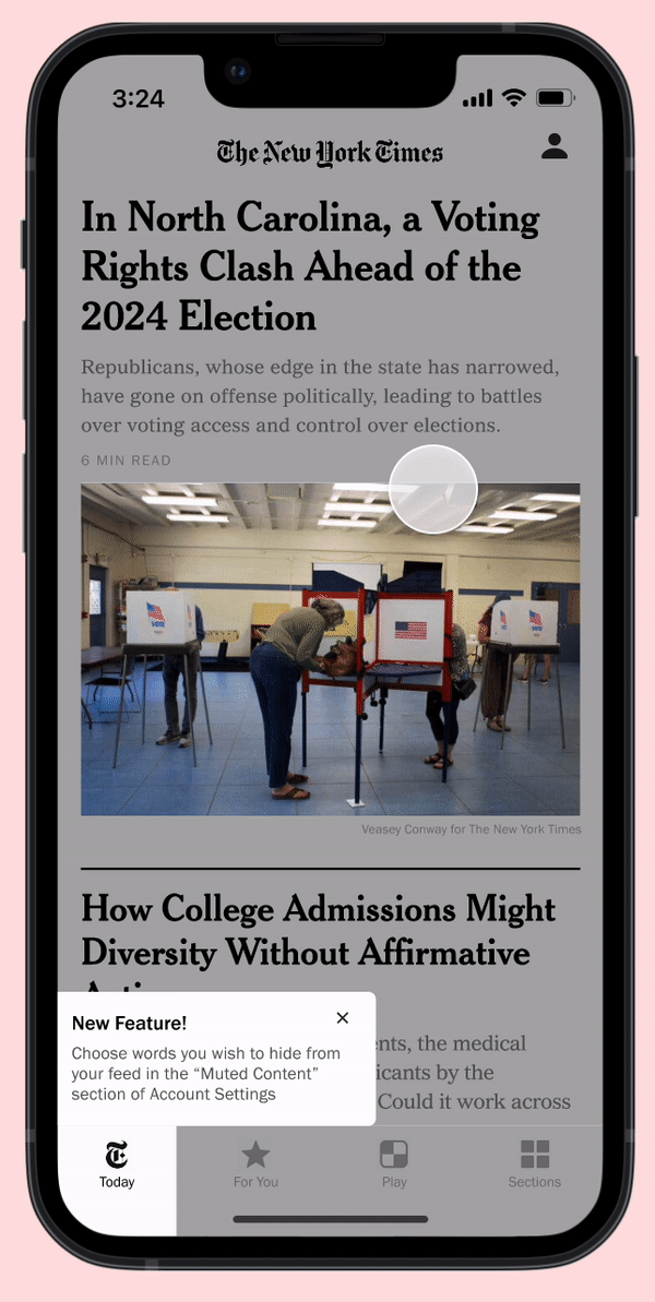
The iterations I made based on the usability test results were straightforward. I added a new introductory screen to notify users about the new feature. I also refined several UI elements on the muted feature screens: enlarged the “Add” button for easier access and adding borders to separate the muted words.

The purpose of a muted content feature
The implementation of the muted content feature in The New York Times News app enhances the reading experience by allowing users to filter out content they find triggering, repetitive, or spoiler-related. This personalization helps users stay informed about current events while tailoring their experiences to their preferences. By offering this level of customization, the app addresses diverse user needs and fosters a healthier relationship with the news.